
Dark background
Logos, colors, and practical guidance for press, partners, developers, and anyone representing Boxpressd.
01 · Logos
Use the primary wordmark whenever space allows. The cards below include approved artwork for brand, social, app, and integration contexts.


The square app icon for product directories, app listings, and editorial references.

The standalone Boxpressd mark for social profiles, avatars, favicons, and compact editorial placements. Gold and adaptable monochrome variants are included.

02 · Color
These values are taken directly from the project theme and current interface. Use the values exactly to keep brand materials aligned with the Boxpressd product.
#D3A966
Primary brand accent
#17191D
Primary dark background
#69798F
Supporting text and UI
#F7F8FB
Soft page background
#FEFEFE
Reversed wordmark and dark surfaces
03 · Usage
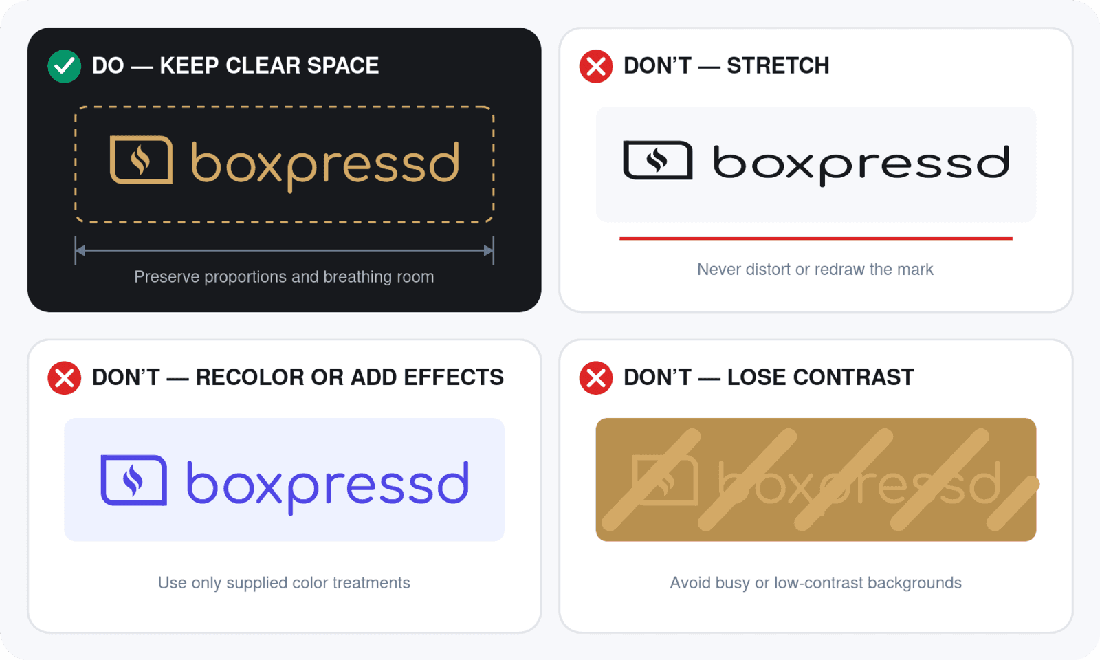
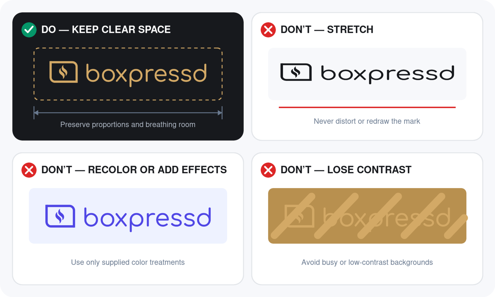
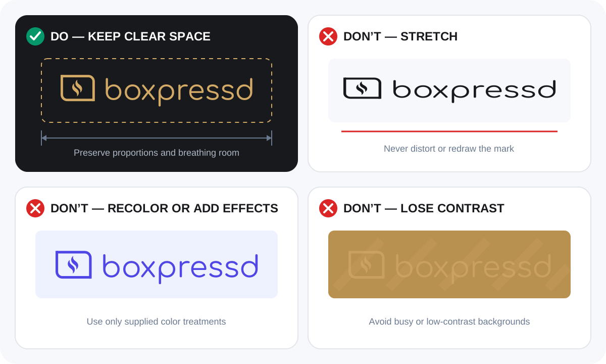
Give the logo room to breathe, preserve its proportions, and favor simple backgrounds with enough contrast. For legal requirements, consult the complete Brand Guidelines and Attribution Policy.
Before publishing
Review attribution, placement, prohibited use, and affiliation rules in the legal brand guidelines.
Download every approved wordmark, social and app icon, attribution badge, color reference, and usage note in one archive.
Full ZIP download